Image Source: Bruna Branco, Teemu Paananen - Unsplash & Adobe Stock
When working in digital photography, graphic design, or print production, understanding colour spaces is essential. Two of the most widely used colour spaces—sRGB and Adobe RGB—each have unique strengths and are suited to specific workflows. Choosing the right one can dramatically impact how your images are displayed and printed.
This guide breaks down the key differences between sRGB and Adobe RGB, helping you decide which is best for your projects.
colour spaces define the range of colours (known as a gamut) that can be represented in digital imagery. They act as a bridge between the colours you see on your screen and those captured by your camera or displayed in print.
In digital design and photography, choosing the correct colour space ensures your images look consistent across devices and mediums, from online platforms to physical prints.

Image Source: Adobe Stock & Thom Masat - Unsplash
sRGB (Standard RGB) was developed in 1996 by Microsoft and HP as a universal colour standard for digital devices. It has become the default colour space for most consumer-grade monitors, cameras, and online content.
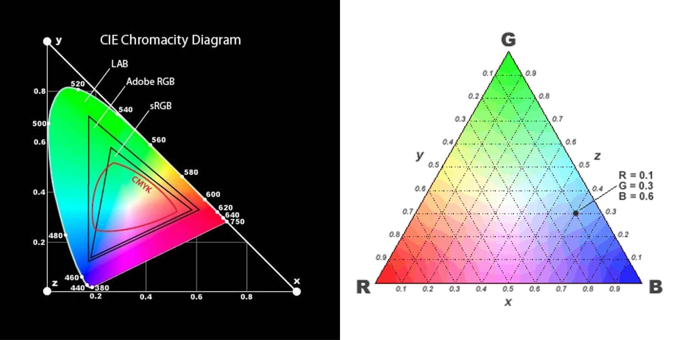
Adobe RGB was introduced in 1998 by Adobe Systems to encompass a wider range of colours, particularly in the green and cyan spectrums. It’s primarily used in professional photography and print workflows.

Image Source: CIE Chromacity Diagram & Maxwell’s Triangle
sRGB ensures consistent colour reproduction across websites, apps, and social media platforms.
Since most consumer devices only support sRGB, using this colour space avoids unintended colour shifts.
Adobe RGB is ideal for photographers aiming to retain maximum colour detail, particularly in prints.
For projects like brochures, posters, or fine art prints, Adobe RGB ensures vibrant, precise colours.
When working with wide-gamut monitors or printers, Adobe RGB takes full advantage of their capabilities.
Ensure your workflow matches the intended output. For example, convert Adobe RGB images to sRGB before uploading them online to prevent colour shifts.
Use calibration tools to align your screen with your chosen colour space, ensuring accurate previews of your work.
Switching between sRGB and Adobe RGB can lead to colour discrepancies. Always edit in the colour space aligned with your output goals.
While Adobe RGB offers a wider gamut, it’s unnecessary for web content or consumer-grade devices.
Far from outdated, sRGB remains the industry standard for digital content due to its universal compatibility.

Image Source: Charisse Kenion & Daniel Korpai - Unsplash
Emerging standards like Rec. 2020 and HDR (High Dynamic Range) displays are expanding the possibilities of digital colour. These advancements aim to capture an even broader gamut and higher levels of brightness and contrast, enhancing realism in both digital and print media. While these technologies promise greater accuracy and vibrancy, sRGB and Adobe RGB remain essential for most workflows due to their widespread compatibility and ease of use. As display technology evolves, understanding foundational colour spaces ensures a seamless transition to new standards.
When it comes to colour management, one key factor to consider is how the chosen colour space translates to the media where the images will be displayed—like your computer monitor, for example.
The most widely used colour space is sRGB, which serves as the default for monitors, web browsers, and these days - many printing labs. Having spent nearly two decades in the industry, particularly with weddings and printing cherished photographs for display, here’s my take:
AdobeRGB does offer a broader colour gamut, theoretically allowing for more vivid and diverse colours. However, it requires a specialized workflow and software to achieve consistent and accurate results, especially in print. Most photographers today rely on labs for printing, or they deliver digital images to clients (or both). If you hand over AdobeRGB files to someone viewing them on an sRGB monitor or using a lab that prints in sRGB, the colours may appear muted or inaccurate. This happens because AdobeRGB tries to compress its wider range into the smaller sRGB space.

Image Source: PI Tutor Justin Aitken - www.justinaitken.com
If you’re unsure about which colour space to use, I recommend sticking with sRGB. It’s the safer and more universally compatible option, helping you avoid confusion and unexpected colour shifts in your images.
Stick with sRGB for simplicity.For most photographers, sRGB is the safest and most practical choice. It ensures accurate colour representation across monitors, browsers, and print labs. If you’re delivering digital images to clients or working with standard printing services, sRGB minimizes the risk of colour inconsistencies.
There is ongoing debate (and disagreement) among photographers about colour spaces, but ultimately, if a device (monitor or printer) can’t utilize a broader colour range, then using one doesn’t provide much benefit.

Image Source: PI Tutor Justin Aitken - www.justinaitken.com
Choosing the right colour space depends on your workflow and the final use of your images. If in doubt, sRGB is your go-to for reliable and consistent results. A broader colour range doesn’t always translate to better output if the viewing device or printer can’t support it.

Photography Tutor at The Photography Institute
Justin Aitken is a Multi Award Winning Professional Photographer. His expertise, creative quality and specialty can be seen in his portrait, lifestyle and wedding photography. His personal work consists of music, landscape and travel photography.
Published:
Understanding colour spaces like sRGB and Adobe RGB is fundamental to creating professional-quality, consistent imagery across mediums. Whether you're sharing online, printing fine art, or delivering client projects, mastering these concepts ensures your work stands out.
The Photography Institute’s online course covers advanced colour theory in Module 7: Refining the Image Process, providing the tools and knowledge to navigate colour spaces confidently. Enrol today to elevate your artistry and technical expertise.